- MMC Help Center
- Getting Started
The updated view of the Migration Wizard’s UI
Last Updated: 11/04/22
Applies to:
Migration Wizard users
Solutions Overview:
Explanation of the recent changes made in the Migration Wizard’s UI
Tactical Rundown:
Our team has recently updated the Migration Wizard’s UI to a much cleaner and more cohesive look.
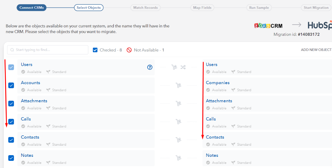
The UI changes are applied to the Select Objects page. Now the objects' names for migration are highlighted in vivid blue color when you hover over them:

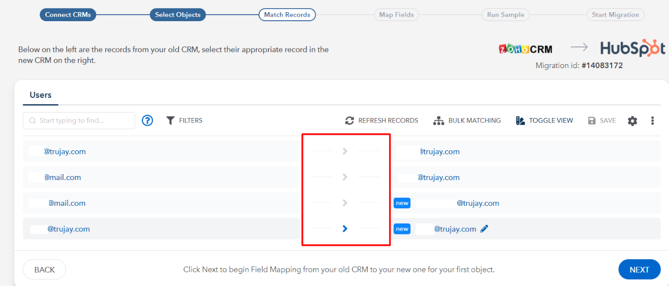
For the Match Records step - the UI is also updated (the space between the source and target CRM’s objects is wider. The objects' names are more readable.

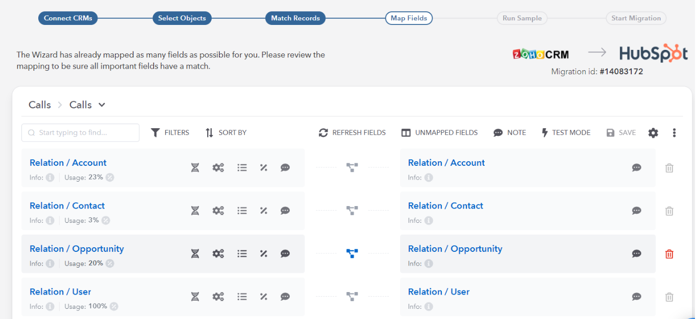
As for the Map Fields step - the view is also updated and now is more easy-to-read:

Still Need Help?
Please submit an inquiry on the contact page or email support@trujay.com.